We're still a few days away from the official beginning of NaMoPaiMo, but it's never too soon for a really good finishwork tutorial! In today's guest post, Brynlee Pulsipher shares her best tips for getting your colors just right. Thank you, Brynlee. This is good stuff!
Color Matching
by Brynlee Pulsipher
Alrighty, as we close in on February, the ‘how do I mix this color’ question is inevitable. I’m going to be honest, there’s color formulas out there, but if you’re going for an exact shade you’ll have to eyeball it at some point! So here’s some tips!
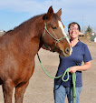
1. Break your reference down into easier to digest pieces. Don’t look at the whole picture, look at parts. Below I’ve circled on a reference to show you some of the different shades on the horse. Start with your lightest areas and get your entire horse that color. Then start to go darker or whatever you need to in the areas of your reference and continue.
Red is the lightest points, yellow is the next, then green, and then blue. Then your black points. This is just an image off the internet, feel free to save these! Even practice on your own and see how close you can get to identifying the different shades throughout the horse to mine!
2. Paint what you see, not what you think you see. Most social media has an eyedropper tool now. In my second set of pics I show that you can find the draw tool, and then use the eye dropper to see exactly which color you should be mixing!
You can make yourself a whole color palette like this!
3. Use complimentary colors to dull shades. If your color is too yellow, add a touch of purple. If your horse is too orange, add blue. If your horse is too red, add green! This works great when mixing pastels, acrylics, airbrush paints, just about everything! Also, don’t darken with black until you can’t get any darker with your brown shades. Some people use purples and such, I haven’t gotten that adventurous yet (editor's note: purple is awesome!).

4. Mix your own colors. This is the best way to really understand colors. My favorite starter set of pastels is available on Amazon and comes with a ton of different color options! I’m still using mine for certain colors five years into customizing! 5. Test your color before it goes on the horse. I keep a clean paper towel off to the side to test all my colors on. I use it for pastels, acrylics, and my airbrush occasionally! This way you can see how it looks without having other colors influence the appearance. For my pastels, I keep a paper plate that I mix all of my colors on as well.
6. Have fun! Don’t stress! There’s always a way to strip paint if everything goes horribly wrong.
Feel free to ask any questions you may have! Experienced artists feel free to chime in with any other advice you might have! I think I covered a good chunk, but I’m sure I’m forgetting something.


.jpg)


That is a wonderful tutorial and I hope to use some of those tips! Many thanks to Brynlee!
ReplyDeleteKaren from MN
You’re so welcome, I hope you’re able to put some of them to use! ❤️
DeleteThank you so much, this is very helpful!!
ReplyDeleteThank you this is great info.
ReplyDeleteLove the different color circles for seeing color changes! Thanks!
ReplyDelete